Monday, 26 March 2012

Conventions of a magazine front cover

Codes And Conventions Of A Magazine Front Cover

A magazine usually consists of different elements such as ‘ingredients’ that all adjoin together to make a successful production.
These elements consist of:
A Masthead: The title used by known typography to make the readers become familiar with what magazine they are reading.


Main Image: Typically consisting of a leading artist(s) or band(s) within the music genre of the magazine, to attract readers.
Strapline: Seen as an introductory headline below the main title (the masthead), to give an insight to the magazine.
Top and Bottom Strip: These are the strips below and above the magazine that give further information to what may be included in the magazine. Mostly being the interesting parts of the magazine.

Pug: ‘The ears of the magazine’, can either be at the top left or/and right-hand corners of the front cover. The prices of the paper, the logo or a promotion are positioned there or even a freebie is placed there to catch the reader’s eye. When the reader is to open the magazine it is likely that they are too see the pug this of which can aware them on the positive aspects inside the magazine.
Tag: This doesn’t have to be on the front cover but I believe that it makes the magazine more efficient as the word or phrase is used to engage a reader’s interest in a story by categorising it e.g. ‘Exclusive’, ‘Sensational’, this showing that the magazine has high compliments.

Coverlines: The essential articles inside the magazine are stated through sell lines, these are regularly seen at the right hand side of the cover.

Left Third: The left third contains the main feature article (Exclusive interview or ‘Puff Piece’), as this is the core part of what may be inside the magazine. It also includes the main artist or band situated within.

Barcode/Dateline & Price: A dateline in which the date of publish and the price are shown, the barcode is just the importance of the retailer.

Keylight: Usually highlighting the main artist or featured lines,

Conventions Of a Contents Page

CODES AND CONVENTIONS OF A MAGAZINE CONTENTS PAGE.

  • Arranged in columns, usually 3 or 4.
  • One main picture relating to a feature article.
  • Other smaller images.
  • They have page numbers on the pictures which anchors them to the written contents.
  • Name of the magazine is at the top, issue date and the word contents.
  • Subscription and contact information.
  • Sometimes an editors letter.
  • Contents divided into catergories and headings used to identify each catergory.
  • Image of the front cover of the magazine.
  • Simple colour scheme.
  • Contents are written in the same way-
    First Line- page number- one or two words which could be artist name or ambigous text to intrigue the reader in bold type, often capital letters (average 12-13pt).
    Sub Line- Gives you more specific detail about what the articles about in smaller font and roman (no bigger than 11pt).
  • Photography is credited for the front cover.
  • Interesting and varied photographs.
  • Features and regulars - main catergory headings
  • Bottom has page number followed by title and issue date, really small font, often followed by a web address.
  • Usually one or two pages, no more.

Monday, 12 March 2012

Evaluation Question 1


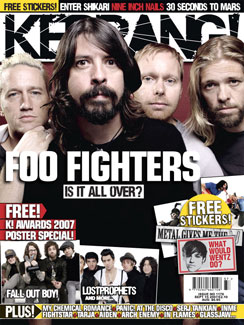
The title in kerrang magazine is similar to the one i used with bold black font and white background as the masthead.
The page layout/model is similar as it uses similar to mine as we Have text in similar places like band names and i have a header and footer similar to kerrangs but i have no pictures on my front cover other then the main one of the band and kerrang has a few small images scattered across the front cover to give the reader an insight as to what other bands are featured in the magazine.
My magazine has a darker picture to reflect the genre of the band and the picture in this is well lit, clear to see, cut out to overpower the title and has no background
The bands costume in both of the magazines appear to just be there casual clothes this shows they not trying to impress anyone and this represents genre and the magazine to be grungy.
The postioning of the models is different in the kerrang magazine compared to mine as the models/bands are postioned higher up in kerrang magazine as there heads begin to cover up the title and in mine the model is more centered.
This magazine has pictures and teasers on the front cover this gives an insight of the content that the magazine features and mine has lines of text telling the reader what bands are inside the magazine this gives the reader an insight as to its content but i should have included some more images on the front page to fill it out more and to make it look less empty.
I would say my magazine appeals to my target market because it has grungy fonts that appeal to the area of the market i am trying to sell to which is the alternative group of social tribes.
The image on the front of my magazine sets the tone for the whole magazine as it has a low light a plain background with lack of props, the picture is also framed so you can see the model clearly and part of the environment he is in (Background) the image was taken at a high angle to make it look like the model we the reader have authority over the model.
I think the fonts used throughout the magazine represents the genre well as is grungy and has attitude i used the DaFont website to get the 'Dirty Headline' font used for the magazines title and various other titles throughout the magazine and the 'Urban Jungle' font which is used for the chiquitos name i found this gave the band more of an identity and made them seem unique.
The Magazine has a similar model to this kerrang magazine as the text is placed very in similar places and the Bands Names Are in Similar places.


My Contents page isn't as filled with content as kerrangs but i feel this gives it a cleaner look and makes it easier to read. My Contents follows the general conventions of a magazine contents page it has pictures sacttered around the page and its listed in columns I believe this makes the page looks clean and easy to read and understand the information. The pictures are all relevent to articles in the magazine. Unlike kerrangs i havent added loads of information like quotes and teaser on my magazine as i wanted to keep it quite simplistic and clean.


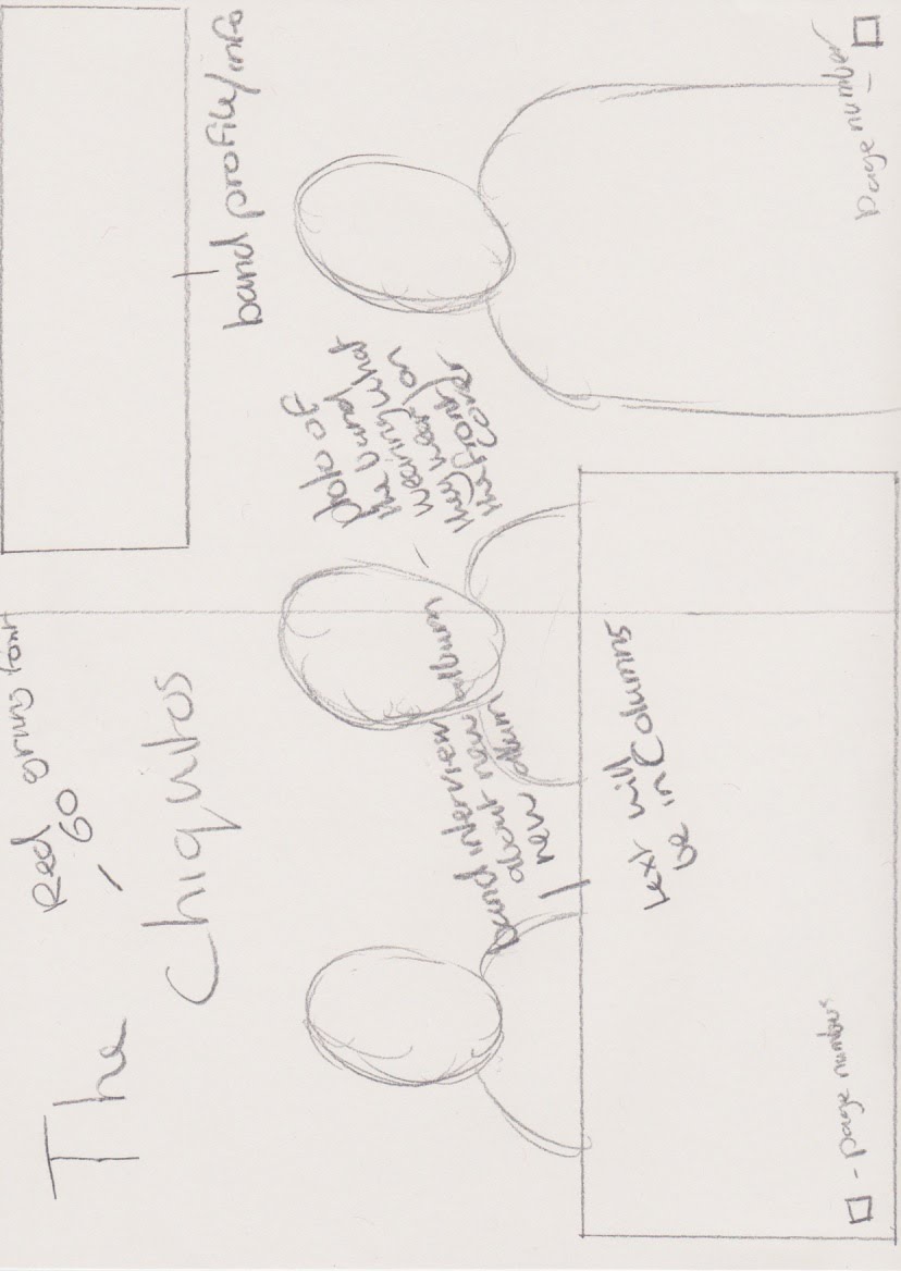
In My Double Page Spread I Decided to seperate my article in to 3 seperate columns and i made the Questions bold to distinguish who was asking them and who was answering them. the font on my bands title stands out from rest of the text and gives the band a unique identity. my photo on the laft page of the double page spread is well cut out and fills the whole page its is is also positioned so it grabs the readers attention and I think this uses the spiral effect. mine dosent have a footer style column running down the side. my double page spread follows most of the basic conventions

Monday, 27 February 2012

things i need to do to improve my magazine based on feedback given

based on the feedback given I need to improve:

I am going to retake all the pictures with the correct band members and with better framing and mise en scene

take more inspiration from other magazines of similar genre

I am going to improve the layout of both my contents page and double page spread

correct text errors in double page spread

make the double page spread fit the genre style

make it known whos telling the questions and whos answering them

have models that are dressed and look more related to the genre of the magazine
keep to about three fonts

have a quote from the band or article on the dps

avoid using yellow fonts make it easier to read

Wednesday, 8 February 2012

Draft Magazine Article

The Chiquitos
The Chiquitos are a brand rock band that has just released their debut album ‘Complexity’. They planned to release the album in late April but due to the recent success of their debut single ‘This Is Now’ they are releasing it at the end of this month. The Chiquitos consists of Will Stanway and Declan Challoner they said “we had been friends for years and have similar musical interests so decided we to form the chiquitos”. The chiquitos are originally from the city of Leicester and they started out playing small gigs in local pubs and bars around Leicester. Their success began when they started recording demos and uploading them to websites such as sound cloud and youtube.
In an interview with the chiquitos this is what we asked:
compared to your musical influences and the style of music you perform would you say they were similar? 
I would say the type of music we write and perform is similar to our musical influences such as Greenday and the clash as we like to use styles and ideas from our influences when we are writing our songs. Thinks like the guitar tones and arrangements of our songs have also been stlyed around our musical influences and what we listen to.
What would you say was the idea/Story behind the album ‘Complexity’?
I would say our album complexity isn’t really based on a story we kind of just started writing songs for fun and it just hit off from there, In the album we just wrote songs about situations we were in and things we were going through like songs about troubles, life and love.
what are your feelings towards releasing the album early?
I was very keen to release the album early as it allows us to gain more publicity and to gain a bigger fan base. it will also give the album more of a chance to spread among the people over media like the internet and TV, I find this will benefit us as we are going on tour at the end of the year.
What does it mean to you to have been signed by virgin records?
At first we started sending our demo to record companies and also uploading our music to sites like youtube, sound cloud and social networking sites, we didn’t really think we would hear anything back from them. So i would say we’re surprised we are where we are now and we are extremely please to be working with virgin records and i am very happy with the album we have produced with them.
What would you say are the chiquitos plans for the future in life and career?
We will continue writing songs and will hopefully be releasing more albums and we are looking forward to touring the world later this year as none of us have done anything like this before so it will be an amazing experience and we are currently talking about releasing a live album of the tour. But to be honest i don't really like to talk to much about the future as is unpredictable we’re kind of just taking everyday as it comes.
What would you say to potential fans who may be interested in your music?
I would ask them to look us up on the internet and take a listen to some of our tracks we are on Youtube, Facebook and Twitter and we are always trying to increase our ever growing fan club on our website. We believe we our a breath of fresh air to this genre of music and we hope that you will enjoy it for those of you who haven't already heard of us.